There are some wildly creative kits among this year's batch, but which one is the best?
You know the 2026 NWSL season is getting closer when teams officially unveil their jerseys. All 16 clubs have a new kit to debut, with two new expansion sides rolling out four shirts between them. Some will be primaries, others will be secondaries, but most are third option kits, and that's where the fun comes in for a few clubs.
Today's soccer kit culture is partially about honoring a club's history, but that's not all. In this era, it's about making sure you're doing that while keeping up with current trends to combine with wearability. Nowadays, fans aren't just sporting jerseys on gamedays; they are part of everyday wardrobes and even a form of expression, depending on how one opts to style them.
So naturally, with all that in mind, I am totally going to rank the 2026 NWSL kits. What does that mean? What is the hip criteria – no, not that one — that will be used to judge them? Well, for starters, it will just be me and my eyeballs and what I think about them.
The truth is that, unlike last year's rollout, where the majority of the kits just seemed aggressively fine, the third kit options are a chance for some fun, so I'll be looking for that too. Significance or special meaning might tip the scales a little bit, but I'm not super interested in 50 different ways to name shades of blue or green.
While I am an advocate for club shops to offer shorts and team socks to fandoms, the teams' entire "uniform" will not matter to me here. What does the shirt look like? Does it look more like a soccer kit or a warm-up outfit? Can you wear it outside of a matchday, and will it look cool on players and on supporters? That's about it.
With that, let's get to ranking the 2026 NWSL kits, and don't forget -- you can watch select NWSL games this season on Paramount+.
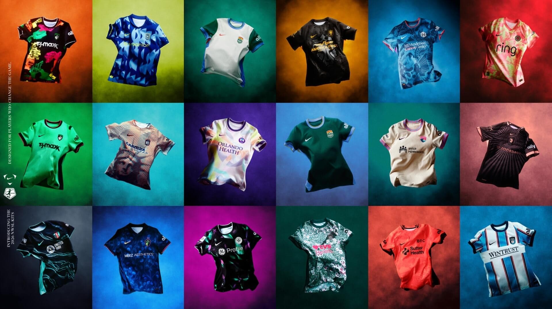
1. Seattle Reign: The Surge (third)
Truly a love-it-or-hate-it type of kit, and by god, this random writer on the internet loves it. If your team is one that sits on the cool side of the color spectrum, you're ahead of the game because cool colors are, well, cool. Seattle does a good job of throwing it way back to their early shades and paying homage to their "highlighter" kits with subtle accents.
Combined with a bold, kind of random geometric pattern, it's delivering on third kit concepts in general -- fun, confusing, and maybe even soccer moms and dads will wear it alongside their kids. Mia Fishel will look cool scoring goals in it, and the casual fan will have enough flair in the kit to pop outside of gamedays.
2. Kansas City Current: Storm kit (third)
It's hard to make a kit that everyone, whether on the pitch or in the stands, will look good in. But the 2025 NWSL Shield winners did just that. The roster is gonna look edgy in their new Storm kits, a dark navy jersey with teal currents running all over it.
The numbers are also in Kansas City's iconic teal hue, and even though it's a third kit, it's exactly the type of jersey you'll want to see your team in regularly if you're a fan. A great color combo that makes the crest pop with its small hints of red, and the details are meant to represent exactly what a water current is with continuous movement throughout.
3. Chicago Stars FC: Gameday DNA kit (primary)
Chicago finally have the kit that matches their rebrand and is probably the only jersey in the rollout that says "soccer kit" the second you look at it. Is it a Serie A side? Is it a Liga MX team? No, it's Chicago's NWSL team, Stars FC, and they are sporting a shirt that is somehow both modern and classic.
It still doesn't beat their 2019 "elevated" kit in my book, but it's a great start for this next era. Gone are the iconic four red stars across the chest, and that's fine; they belong on the flag, where the club borrows some of its imagery from. Including the striping, the vertical lines narrow as they head outward, just like bars on the city's flag.
4. Angel City FC: Flare kit (primary)
I need to preface this by saying that I think center crests are dumb. Unless they are used to commemorate a team's achievements -- World Cup wins, Continental tournaments -- leave them where they are supposed to be, on the left-hand side of the shirt. That being said, congrats to Angel City FC, who made sure the kit was so good that it bumped them near the top.
I think a primary black kit with just the right amount of detail is great, and the organization delivered one to celebrate its fifth anniversary as a club. A cool design that mirrors a sol image and a nod to the pink (sol rosa) accents throughout the kit. You add the number five instead of the letter S in the club's slogan "VOLEMO5," and it's a simple twist that works.
5. Gotham FC: Lady Liberty kit (third)
Commiserations to all the New Jersey faithful out there. If Gotham weren't fully separating themselves from the Garden State in name (they dropped NJ/NY in front of their moniker last season), they certainly are now with this extremely, undeniably, New York City kit.
Inside Gotham's third kit is a not-so-hidden image of the Statue of Liberty's head. Wrapped in shades of blue and orange, NYC's flag colors, the closer you get, the blurrier it becomes. But that's where the fun lines come into play. The farther away you go, Lady Liberty pops up like a 90's magic eye 3D puzzle you don't have to strain your eyes to see. Not for you? That's ok. Champion sentiment means they get to rock what they want.
6. Racing Louisville FC: Disco kit (third)
Did you know that Louisville makes more than bourbon and baseball bats? At one point, they produced 90% of the world's disco balls during the disco era, and this third kit is a shout-out to that time.
It's creative, out-of-the-box look means that instead of just a simple design outlining a disco ball, Racing's kit is a literal reflection. You see splashes of purple and green hues throughout the kit, like lights hitting a mirrored globe, defined by black borders. The pride mark "Made in Looavul" is a great way to make sure folks put respect on your name. A great kit and sentiment for a club that's coming off its first playoff appearance.