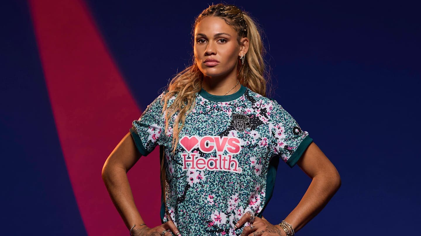
The Spirit unveiled their new kit ahead of the upcoming NWSL season. | Courtesy of the NWSLShare on FacebookShare on XAdd us on The 2026 National Women’s Soccer League season is almost upon us, and with that comes two expansion teams and 16 brand-new kits! Every club has put out at least one new kit, whether primary, secondary or third, and each kit aims to celebrate the culture of the team and its hometown or state.
The 2026 National Women’s Soccer League season is almost upon us, and with that comes two expansion teams and 16 brand-new kits! Every club has put out at least one new kit, whether primary, secondary or third, and each kit aims to celebrate the culture of the team and its hometown or state.
While we’re spoiled with a pretty decent slate of new kits this year, some of them definitely rise above the others. With stunning visuals, thoughtful details, and bold ideas, we present to you Sports Illustrated’s 2026 NWSL new kit rankings:
While we’re spoiled with a pretty decent slate of new kits this year, some of them definitely rise above the others. With stunning visuals, thoughtful details, and bold ideas, we present to you Sports Illustrated’s 2026 NWSL new kit rankings:
Courtesy of the NWSLWhile visually pleasing, Seattle’s third kit, “Surge,” feels a little phoned in. The design is meant to show where the past and present meet, with a concord blue background and a royal pulse that represents the rising energy of what’s next. For such a historic and iconic NWSL club, you’d expect to see a little bit more. However, this fun design is definitely befitting of a third kit, and I’m sure it will pop on the pitch.
While visually pleasing, Seattle’s third kit, “Surge,” feels a little phoned in. The design is meant to show where the past and present meet, with a concord blue background and a royal pulse that represents the rising energy of what’s next. For such a historic and iconic NWSL club, you’d expect to see a little bit more. However, this fun design is definitely befitting of a third kit, and I’m sure it will pop on the pitch.
Courtesy of the NWSLThere is simultaneously not enough and too much going on with this kit. The “Electric Boom” primary jersey aims to combine the brilliance of the club and the energy of the community, while also highlighting the brand’s historic green and red colors. The best part of the jersey is the gorgeous pride mark on the bottom with the Oregon state motto, “Alis Volat Propriis” (She Flies With Her Own Wings), arched over a rose.
There is simultaneously not enough and too much going on with this kit. The “Electric Boom” primary jersey aims to combine the brilliance of the club and the energy of the community, while also highlighting the brand’s historic green and red colors. The best part of the jersey is the gorgeous pride mark on the bottom with the Oregon state motto, “Alis Volat Propriis” (She Flies With Her Own Wings), arched over a rose.
Courtesy of the NWSLThe Colorado expansion side is ready to make its debut with both a primary and secondary kit. While the secondary kit is a classic white, the primary kit, “Evergreen,” really brings together a design that reflects the club’s home state in its details. The evergreen color beautifully symbolizes Colorado’s pine forests, and the blue stripes evoke the Mile High City’s sky. While the coloring is gorgeous and the crest is among the best in the league, the plainness of the kits drops Summit down in the rankings.
The Colorado expansion side is ready to make its debut with both a primary and secondary kit. While the secondary kit is a classic white, the primary kit, “Evergreen,” really brings together a design that reflects the club’s home state in its details. The evergreen color beautifully symbolizes Colorado’s pine forests, and the blue stripes evoke the Mile High City’s sky. While the coloring is gorgeous and the crest is among the best in the league, the plainness of the kits drops Summit down in the rankings.
Courtesy of the NWSLFor their third kit, Bay FC presented the “Poppy” jersey. The gorgeous poppy color takes center stage, a stark departure from the darker main colors of previous kits. The bridge pattern on the kit could be a little bit clearer, which is why this kit doesn’t crack the top 10, but it’s a valiant effort from the third-year California side.
For their third kit, Bay FC presented the “Poppy” jersey. The gorgeous poppy color takes center stage, a stark departure from the darker main colors of previous kits. The bridge pattern on the kit could be a little bit clearer, which is why this kit doesn’t crack the top 10, but it’s a valiant effort from the third-year California side.
Courtesy of the NWSLIgnoring the sponsor here, the yellow accents on this black jersey are really working for Utah’s third kit, called the “Swarm.” The kit centers the club’s iconic lioness surrounded by … are those bees? Did you know that Utah is the Beehive State? Well, you do now! This kit is spooky, but if you think about it, a swarm of bees is sort of soccer-ish. A team sport where, as the club puts it, no single bee defines the hive. The team’s success relies on collective effort, and the spooky bees may certainly inspire Utah to keep building on a strong end to last season.
Ignoring the sponsor here, the yellow accents on this black jersey are really working for Utah’s third kit, called the “Swarm.” The kit centers the club’s iconic lioness surrounded by … are those bees? Did you know that Utah is the Beehive State? Well, you do now! This kit is spooky, but if you think about it, a swarm of bees is sort of soccer-ish. A team sport where, as the club puts it, no single bee defines the hive. The team’s success relies on collective effort, and the spooky bees may certainly inspire Utah to keep building on a strong end to last season.
Courtesy of the NWSLThere is a lot going on with this Houston Dash jersey, and “a lot” seems to be the theme of some of the upcoming third kits. For the Dash’s third kit, called “Houston Chronicles,” it really comes together. Five separate elements comprise the blue background of this jersey: the original Houston Chronicle building, magnolia flowers, a paisley cowboy motif, geometric textiles symbolizing the city’s diversity and “Space City” representing NASA. Some might think it’s a little too busy, but the kit is meant to be a tapestry of the city of Houston, and I believe it achieves what it sets out to do.
There is a lot going on with this Houston Dash jersey, and “a lot” seems to be the theme of some of the upcoming third kits. For the Dash’s third kit, called “Houston Chronicles,” it really comes together. Five separate elements comprise the blue background of this jersey: the original Houston Chronicle building, magnolia flowers, a paisley cowboy motif, geometric textiles symbolizing the city’s diversity and “Space City” representing NASA. Some might think it’s a little too busy, but the kit is meant to be a tapestry of the city of Houston, and I believe it achieves what it sets out to do.
Courtesy of the NWSLAt first look, the Wave’s third kit, “Balboa Park,” might not seem like much is going on, but the devil really is in the details for this Southern California side. The patterns on the sleeves and collar are meant to represent the iconic tile work of San Diego’s Balboa Park, a historic urban oasis. What always works for the Wave is the gorgeous colorway of their crest, which serves as a bright, fun part of the entire kit.
At first look, the Wave’s third kit, “Balboa Park,” might not seem like much is going on, but the devil really is in the details for this Southern California side. The patterns on the sleeves and collar are meant to represent the iconic tile work of San Diego’s Balboa Park, a historic urban oasis. What always works for the Wave is the gorgeous colorway of their crest, which serves as a bright, fun part of the entire kit.
Courtesy of the NWSLThe other 2026 expansion side has graced us with its primary and secondary kits. Unfortunately, the Legacy’s primary kit, “First Light,” is pretty bland, even if the colors are eye-catching. It’s the team’s second kit that lifts Legacy into the eighth spot. “Common Ground” features imagery and shapes that represent Boston’s neighborhoods. The secondary kit takes the “First Light” colorway to the next level, creating a more thoughtful kit for the NWSL’s newest side.
The other 2026 expansion side has graced us with its primary and secondary kits. Unfortunately, the Legacy’s primary kit, “First Light,” is pretty bland, even if the colors are eye-catching. It’s the team’s second kit that lifts Legacy into the eighth spot. “Common Ground” features imagery and shapes that represent Boston’s neighborhoods. The secondary kit takes the “First Light” colorway to the next level, creating a more thoughtful kit for the NWSL’s newest side.
Courtesy of the NWSLWith a team name like Current, there’s a lot that can be tied into the club’s theme, and Kansas City once again got it right with its “Storm” third kit. The colorway really ties it together, along with a pattern that represents a current. It’s clear, clean and will look great on the pitch.
With a team name like Current, there’s a lot that can be tied into the club’s theme, and Kansas City once again got it right with its “Storm” third kit. The colorway really ties it together, along with a pattern that represents a current. It’s clear, clean and will look great on the pitch.
Courtesy of the NWSLDid you know that Louisville once produced 90% of the world’s disco balls? Now you do! And Racing’s “Disco” kit celebrates that history in a fun, colorful way. The team’s third kit plays off its classic lavender and mint green colors, “disco-fies” them, and makes them really pop on the black background. A really fun effort here that combines history with visuals that grab you without being too busy.
Did you know that Louisville once produced 90% of the world’s disco balls? Now you do! And Racing’s “Disco” kit celebrates that history in a fun, colorful way. The team’s third kit plays off its classic lavender and mint green colors, “disco-fies” them, and makes them really pop on the black background. A really fun effort here that combines history with visuals that grab you without being too busy.
Courtesy of the NWSLAngel City is celebrating their fifth season with a new primary kit, “Flare.” It boasts a center crest and playfully uses it to integrate a sol rosa sunburst pattern that radiates outward. As the team puts it, it’s meant to be from “soul to sol.” The sol rosa pink really pops on the black, and the pink stripes on the sleeve tie the look together. A truly stunning kit from Angel City here.